NIGHTTIME-LIGHTS ECONOMIC PULSEDATA THROUGH 2026-07 · 103 MONTHS · NASA BLACK MARBLE
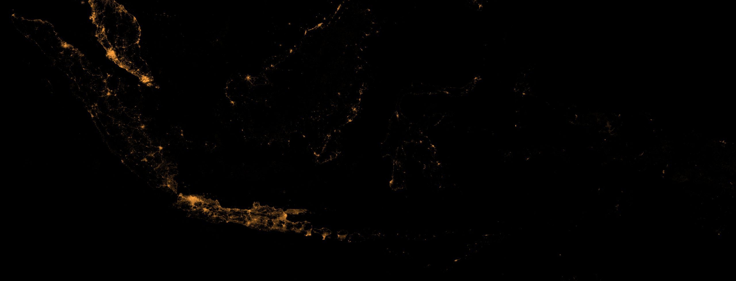
From 830 km up, Indonesia looks like this.
Every year since 2012, every month since 2018: satellite radiance
translated into a regency-level map of economic activity, refreshed monthly
against regional accounts that arrive once a year.
VJ146A3 · 2026-07 · 15 ARC-SECOND COMPOSITE
ANNUAL COMPOSITES · ONE FIXED STRETCH
▾
01 · Concentration
Java carries the light
67% of Indonesia’s night light
comes from 6.6% of its land.
LIGHT
LAND
One island holds the archipelago’s economic gravity. Every regency’s share
of that light — and how it moves month to month — is measurable from orbit.
That is what this instrument does.
02 · The pulse
The series so far
National sum of lights per month, 2018 to the latest composite; the
ledger grows by one month each time NASA publishes. Hollow points mark
monsoon months, where cloud cover leaves few clear observations — the
pipeline reports what it cannot see rather than guessing. Press play on the
map below to watch every regency move.
Values are lights-implied activity, not GDP. The coverage-weighted,
seasonally adjusted version of this series meets BPS’s regional accounts in chapter 04.
03 · Where
Where the light is · 2026-07
TOTAL LIGHT — BREADTH
Bekasi73,168
Bogor70,517
Tangerang65,661
Banyuwangi56,982
Kota Surabaya52,304
Karawang44,331
Sidoarjo37,640
Kota Semarang34,699
Kota Bekasi32,438
Kutai Kartanegara30,558
MEAN RADIANCE — INTENSITY
Kota Jakarta Pusat64.4
Kota Jakarta Barat45.3
Kota Jakarta Utara44
Kota Jakarta Selatan43.3
Kota Yogyakarta34.5
Kota Tangerang33.8
Kota Jakarta Timur33.3
Kota Surabaya33
Kota Tangerang Selatan32.4
Kota Bekasi32.2
Breadth and intensity tell different stories: industrial Bekasi and Bogor
lead on total light, while Jakarta’s dense urban cores lead on brightness per
pixel. (Kutai Kartanegara’s total is inflated by gas flaring — chapter 04
shows the flare mask that corrects for it.)
04 · Calibration
The instrument, calibrated
Do the lights actually track the economy? Here the index meets BPS’s
regional accounts: real PDRB for all 514 regencies — annual and quarterly.
The verdict is two-sided, and both sides are printed. Where activity
is, lights explain about 70% of the cross-regency variation, every year
(the location check). When it moves, the short-run link is too weak to use: the
growth coefficient’s interval contains zero, and out of sample the mapping
loses to simply assuming last year’s growth. 2020 is usually offered as the
proof case; on our own numbers it is not one — lights fell 2.1% and GDP fell
2.1%, but satellite coverage collapsed that year too, so signal and artefact
cannot be separated. The uncertainty bands below are that sentence, drawn.
Where · levels fit—
Elasticity (within regency)—
When · short-run growth link—
Growth nowcast · withdrawn—
LIGHTS-IMPLIED ACTIVITY VS OFFICIAL GROWTH · YEAR-ON-YEAR
Lights-implied growth = the quarterly growth calibration
(a + β·Δlog lights) applied to the deseasonalised national series; the band is a 95% interval from the
calibration’s parameter and residual uncertainty. It is an activity index, never GDP. The shaded
zone is the nowcast — months where BPS has not yet published.
LOCATION CHECK · LOG REAL PDRB ~ LOG LIGHTS, ONE DOT PER REGENCY
WHERE SATELLITE AND STATISTICS DISAGREE
Largest standardised residuals in the latest BPS year. A regency that is
bright but poor, or dark but rich, is one where the satellite and the statistical office tell
different stories — a question worth asking, and the most useful thing this instrument
produces. Hollow dots on the scatter are flare-corrected oil & gas regencies.
FLARES REMOVED BEFORE ANY OF THIS
Calibration data hasn’t published yet — this chapter fills in
when the model stage lands on the server.
05 · Explore
Every regency, every month
Total light is the sum of radiance falling inside a regency, so it
rewards size and breadth — big industrial regencies lead. Intensity is the mean radiance
per pixel, which is independent of size — dense city cores lead. Darker means dimmer, on a log
scale that is fixed across all 103 months, so colours are comparable as the player runs.
One consequence is worth knowing before you read the animation: a cloudy monsoon month goes dark
across the whole map because the satellite saw less of it, not because the lights went out. The
coverage figure below the slider tells you which months those are.
TOTAL LIGHT
log scale · fixed across all months · top 0.5% clipped
06 · Review
We had this instrument reviewed, adversarially.
An independent read of the same data against the published literature. It replicates Gibson
et al. (2021) on Indonesian kabupaten and finds their rural verdict is a property of the sensor
product, not of night lights; it explains why the growth nowcast has been withdrawn; and it
corrects a claim this page used to make about 2020.